Google Calendar Web Finally Embraces Dark Mode with a Modern Redesign
Google's web-based Calendar app is getting a significant update, finally introducing a dark mode option for users seeking a more eye-friendly interface during their late-night scheduling sessions. This update, rolling out as part of Google's Workspace suite, is based on the latest Material Design 3 guidelines, which focus on easier access, readability, and a modern aesthetic.
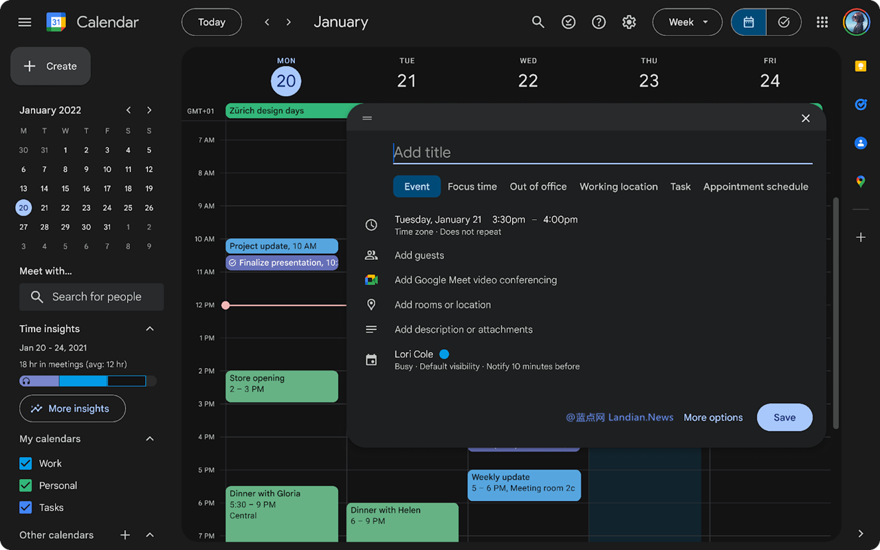
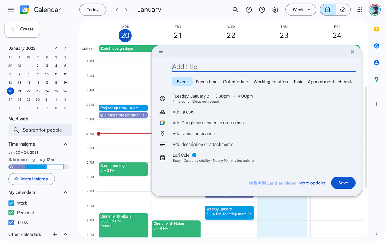
Key Features of the New Google Calendar Update:
Support for Dark and Light Modes: Users can now toggle between dark and light themes or set the interface to adjust automatically based on their device settings. This feature is particularly useful for those who work in different lighting environments or prefer a darker interface to reduce eye strain.
Modernized Interface: The update brings a fresh look to Google Calendar with redesigned buttons, dialogs, and sidebars. The interface now uses custom Google-designed fonts that are clear and easy to read, making schedule management more intuitive.
Enhanced Visuals: Alongside functional improvements, the visual presentation of Google Calendar has been revitalized with crisp, vibrant images that contribute to a refreshed user experience.
Accessibility Improvements: With the adoption of Material Design 3, the web version of Google Calendar enhances its accessibility with modernized controls that are easier to navigate.
Rollout Information:
The rollout of the new Google Calendar web version began on October 23, 2024, and is expected to reach all users within 15 days.
This update is available to all Google Workspace subscribers as well as non-subscribers, ensuring that everyone can benefit from the new features and improvements.
Once the update is fully deployed, the new version will completely replace the old version, with no option to revert to the previous design.
