From Viewer Feedback to Redesign: YouTube's Latest Playback Interface
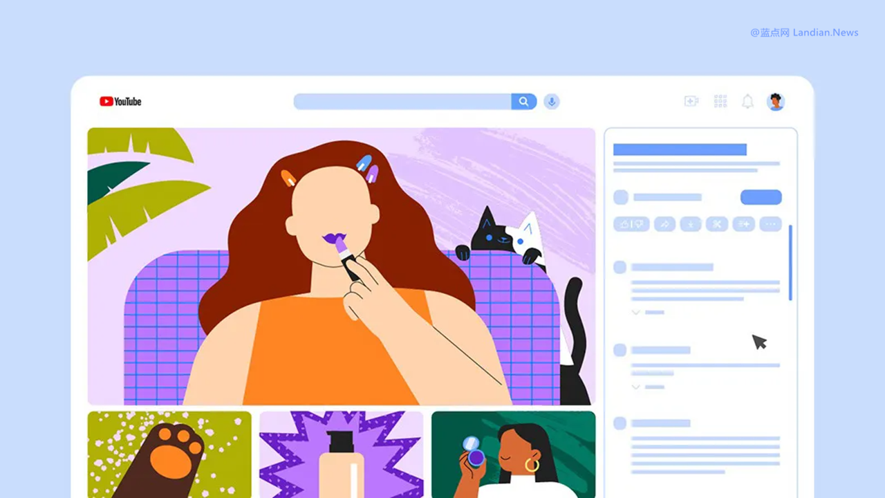
Google's video hosting platform, YouTube, is currently undergoing a significant redesign, with a particular focus on overhauling the video playback interface. The new design sees video titles, likes, shares, and comments all moved to the right side of the screen.
In this layout, the main screen still prominently features the video, but recommended videos are now directly below it. This allows users to see the complete title, comments, and other details without needing to scroll down the page.
The rollout of this new playback interface began unexpectedly in April and was met with considerable backlash from a portion of users. YouTube subsequently retracted the update and began a controlled rollout.
During this controlled rollout phase, the new interface was made available to a very limited number of users to collect feedback. Now, users of YouTube Premium should see a prompt inviting them to switch to the new style and provide feedback to YouTube.
At least for the time being, users still have the option to stick with the old playback interface. However, the new interface is expected to improve and be fully launched in the future, meaning all users will eventually need to adapt to this new design.
Notably, the new interface seems to prioritize recommended videos, placing them directly below the video player. This positioning could potentially enhance user engagement and lead to better click-through rates for recommended videos compared to the previous design, where they were displayed to the right of the video.
For Google, attracting users to watch more videos is crucial for displaying more ads. Thus, this redesign appears to be aimed at achieving exactly that—encouraging users to engage with more recommended content, watch more videos, and, consequently, view more ads.
