SanDisk, a Western Digital Brand, Switches Logo, Making It Harder to Read
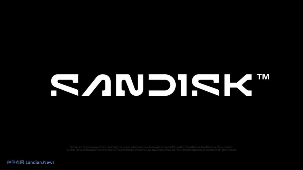
Western Digital's storage brand SanDisk recently announced an update to its brand logo. The new SanDisk logo retains a purely letter-based style but adopts a variety of font changes that, in practice, make it harder to read.
Viewers of SanDisk's promotional videos might understand that the new logo primarily seeks to convey a sense of motion. The company plans to make a comeback in 2025 as an independent innovator in flash memory and memory technology.
In an official press release, SanDisk stated that the new creative direction is defined by a "motion mindset," representing a forward-looking philosophy. This philosophy aims to create infinite paths and possibilities for people, combining the present moment with people's aspirations to bring them closer to their dreams and desires, creating a cooperative circle that fosters progress and future development.
In some ways, the new logo does indeed align with SanDisk's image. SanDisk's main products are solid-state drives, USB drives, and memory cards, all of which prioritize high speed.
SanDisk claims that the new logo is meant to embody innovation, with its simple lines and minimalist design reflecting the speed and efficiency of Flash technology. However, the logo is indeed challenging to read due to the cut-off design of the letters.
In terms of color, SanDisk has also switched to a black and white color scheme, moving away from the red that has been a long-standing choice for the brand. The black and white color scheme may offer a cool feel, matching well with the ultra-fast speed characteristic of flash storage products.
Starting next year, SanDisk's new logo is expected to gradually appear on products, and the product color scheme is also anticipated to change. With the original eye-catching red turning into a black and white style, SanDisk might need to find a new way to enhance brand recognition among consumers.
